A Feed Ad Optimizer Managing 2M+ Monthly Spend Shares the Science Behind High-ROI Campaigns (In-Depth)
With feed advertising's push-based mechanism, achieving high ROI is far harder than keyword-targeted search marketing. This guide walks through a complete, systematic framework for running feed ad campaigns — from audience targeting to creative design to landing page optimization and performance analysis.
As mobile internet continues to surge, feed advertising has become the darling of digital marketing. The push-based model is steadily displacing keyword-driven search marketing, and consumer attention has grown increasingly fragmented. Getting your target audience to actually notice your ad has become one of the central challenges for businesses of all sizes.
Under this push-based paradigm, achieving strong ROI is significantly harder than it is with precision keyword marketing. In this post, I’ll walk through what a complete, well-structured feed ad campaign looks like from end to end.
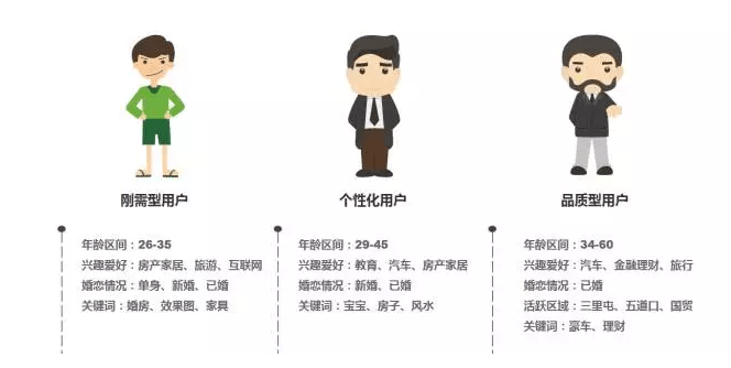
Let’s start with a high-level view of the campaign feedback loop:
Here’s how each step plays out in practice:
I. How to Target the Right Audience
01. Conduct User Research to Establish a Baseline
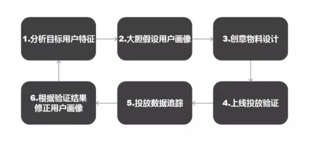
Before you launch anything, you need a working hypothesis about who your audience is — and that requires user research. The same research data also underpins your copywriting, giving you the raw material to craft messaging that resonates. Let me break down different research methods by user type.
Simple methods for gathering user profile data:
-
Basic demographics: Collect from two main sources — aggregating data from users who have already converted, and conducting one-on-one interviews at events or in-person touchpoints.
-
Behavioral characteristics: Analyze user flow and heatmaps on your website. By observing which sections attract the most attention across different traffic sources and browsing environments, you can identify and validate behavioral patterns.
-
Interest characteristics: Draw inferences by cross-referencing the first three data categories and forming hypotheses about your user persona.
02. Map Out Who Your Audience Actually Is
Once you’ve gathered your user tags and built a working understanding of your users, you can begin constructing audience personas. For each audience type, assign a corresponding targeting strategy. Before any campaign goes live, I ask myself three questions:
- Who: Which distinct user segments might be interested in this product?
- Where: What contexts are these users active in, and what behaviors do they exhibit there?
- Why: Which specific needs does this product address for each segment, and how does it compare to existing alternatives?
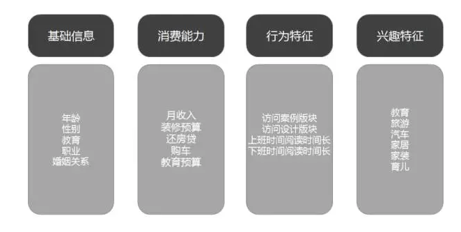
Using home renovation as an example, I typically divide the audience into three categories:
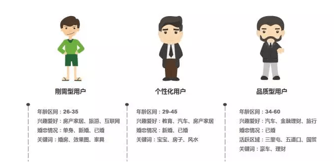
Understanding these distinct audience groups leads to very different campaign strategies. For instance, high-income “quality seekers” tend to have stable careers and aspire to a home that signals their status — they’re detail-oriented about materials and value human-centered design because they’re often managing multi-generational households. “First-time buyer” segments, on the other hand, skew younger, are heavy internet users, care about smart home features, but are extremely price-sensitive. Segmenting your audience properly and running targeted campaigns for each group is one of the most reliable ways to lift overall ROI.
03. How to Maximize Impressions Within Your Target Audience
A common frustration in feed advertising is over-segmentation: targeting criteria so narrow that the account barely delivers any impressions. But since targeting is a core lever for campaign performance, you can’t simply loosen it at will. So how do you get more reach within a defined target audience? Start by identifying the key variables that actually drive impressions.
Here’s a concrete example:
Ad A has a 1% CTR and a bid of 0.5. Ad B has a 3% CTR and a bid of 0.4. On the surface, Ad A’s advertiser appears to be paying more. But from the platform’s perspective, Ad B generates ¥12 per 1,000 impressions, while Ad A generates only ¥5. If you were the platform, how would you allocate traffic?
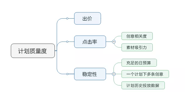
This logic points to three factors that drive impressions: bid, CTR, and account stability. Bids are constrained by target CPA, so you’re always trying to bid as low as possible. Account stability is a natural outcome of a mature campaign and involves too many uncontrollable variables. That leaves CTR as the primary controllable lever for winning more impressions. If your CTR significantly outperforms the platform average, the platform will reward you with more distribution — because your creative clearly resonates with users, and that’s good for user experience too.
II. What Makes a Creative That Actually Grabs Your Audience
01. Write Copy from the User’s Point of View
When I first started running campaigns, I didn’t know what to write, so I’d pile on every product feature I could think of. I assumed users would see what I saw — that they’d understand the product as well as I did and immediately grasp the benefits. Writing from the assumption that customers are already familiar with you is a trap that leads to self-indulgent copy that speaks to no one.
The reality is that users know nothing about your product and couldn’t care less about your feature list. The only reason someone will pay for your product is that it helps them accomplish a specific job or solve a specific problem. Your ad headline needs to tell users clearly what outcome the product delivers for them — what task it helps them complete. Customers only care about the job they’re trying to get done.
Even knowing this, it’s still easy to write copy that misses the mark — because there’s often a wide gap between product features and genuine user needs. Lead only with features and the user has no purchase motivation. Promise users everything they want and they’ll instinctively disbelieve you. This changed for me when I came across a copywriting framework called the “Copy Ladder,” which maps the chain from product benefit to user job to deeper user value. Since then, before writing any ad copy, I run through the full chain: the concrete benefit the product delivers → the job that benefit helps complete → the user value that job reflects. Here’s the framework:
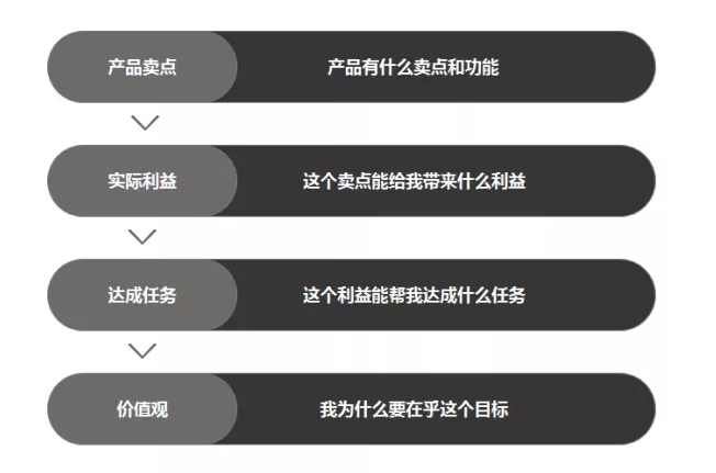
For example:
One of our product’s selling points was “free design consultation.” What result does that deliver? One answer: “You can see what your renovation would look like without spending anything.” What goal does seeing that outcome serve? “Make your home more beautiful through design.” And why does making the home more beautiful matter so deeply to this user? Because their underlying value is: “After working this hard, I deserve to live somewhere worth coming home to.”
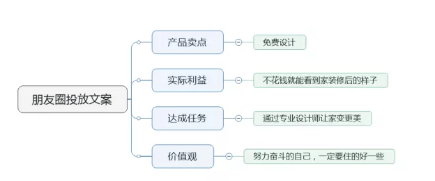
Here’s a real ad copy example: this was a national WeChat Moments campaign with a CTR of 1.3% — slightly above the platform average — but a registration conversion rate of 50%, more than double most other channels. Here’s why the copy worked:

- “Improve your living environment” — the job the user is trying to get done (aligned with user need)
- “You don’t have to spend a fortune” — acknowledges that price has been a barrier to completing that job (pain point)
- “Claim your free 0-cost design consultation” — the solution that removes that barrier (the cure)
- “Create a designed-feeling home for less” — speaks directly to the goal of making home more beautiful (the ultimate outcome they want)
02. Choose Selling Points That Communicate Value Instantly
Now that we’ve covered how to write copy that resonates, let’s talk about how to select the right selling point for feed ads. The feed environment is very different from traditional display advertising — the canvas is small, competing for attention against a flood of other content. If a user can’t see the value of your ad at a glance, they’ll scroll past. Choosing the right selling point is therefore critical.
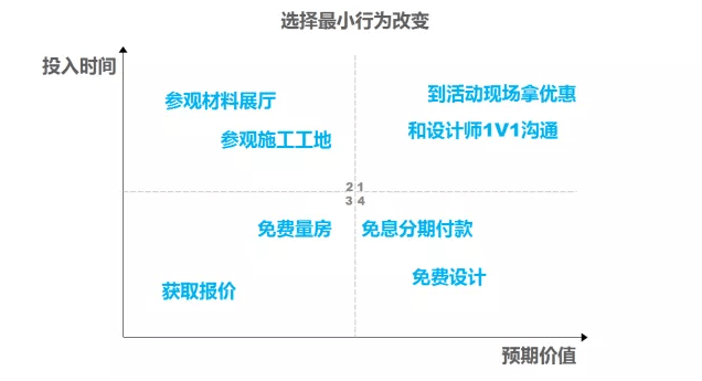
I evaluate selling points along two dimensions: time investment (how long it takes the user to get a result from this feature) and expected value (how meaningful the benefit ultimately is to the user).
Looking at the four-quadrant matrix below, Quadrants 3 and 4 — low time investment with value delivered quickly — are best suited to feed advertising.
Quadrant 1 — high time investment with high eventual return — is a better fit for intent-driven channels like Baidu search. Users arriving with a search query already have clear intent and are prepared to invest time in a decision.
03. Image Creatives That Anyone Can Understand in Under 3 Seconds
The KISS Principle: Even a complete stranger should get it in 3 seconds.
In the crowded, noisy world of feed advertising, users’ attention is spread thin across an overwhelming volume of content. Your ad creative needs to communicate its core message immediately. Pick the single most valuable selling point and present it with maximum simplicity so users understand your product’s core value proposition within three seconds.
For image creative design, I follow four rules:
- KISS: The user should immediately understand what product or service you’re offering.
- Light backgrounds first: Light backgrounds create contrast that makes your product stand out more effectively.
- Clean typography: Text should cover no more than one-third of the image; white space around your copy makes it easier to read and ensures the message lands fast.
- Visual clarity: Use high-quality, sharp imagery; limit yourself to three colors; avoid centering everything, which can create a stiff, lifeless feel.
Outstanding advertising isn’t about novelty or cleverness for its own sake. Great ads simplify, clarify, and dramatize — they leave a lasting impression in the consumer’s mind. Chase narrative complexity and you risk obscuring your message entirely.
— Bill Bernbach
04. Match Your Creative to the Time and Context of User Consumption
Feed platforms let you set specific time windows for each campaign, but most advertisers simply run the same creative 24/7. This is leaving significant performance on the table. Users are in very different mindsets and contexts throughout the day. Designing creative that speaks to those different moments — and adjusting your landing page content accordingly — can meaningfully lift CTR. Users will also sense that the advertiser understands them, which builds goodwill. I noticed that EF Education uses exactly this approach in every campaign they’ve served me:
Commute hours: 6:00–9:00 AM and 5:00–7:00 PM

Work hours: 9:00 AM–6:00 PM

Evening hours: 7:00 PM–midnight

05. Systematically Capture Learnings and Keep Optimizing
The review phase is primarily about A/B testing: tag and file away both your top-performing audience segments and your best-performing creatives. High-quality creative templates reduce back-and-forth with your design team; validated high-intent audience segments can be recycled into future campaigns to cut down on the trial-and-error costs of getting started fresh each time.
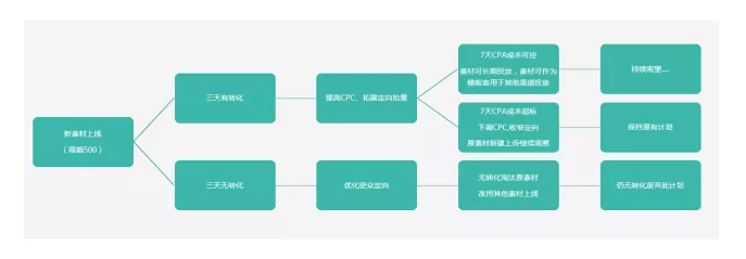
Here’s a promotion workflow SOP that I’ve refined over time:
III. How to Turn Visitors into Conversions
Once your carefully crafted creative has brought potential users to your landing page, the real challenge begins.
Feed advertising users are habitual skimmers. They won’t linger on a single page for long. GA data consistently shows average session durations of 15–20 seconds. Whether your landing page can communicate effectively within that 20-second window is everything. Before diving into landing page specifics, though, it’s worth being clear on something foundational: why do businesses need a dedicated landing page at all, and what is its core mission?
01. What Is the Landing Page’s True Mission?
When a user clicks through from an ad creative to your landing page, what role is the page supposed to play?
Think of it like two strangers meeting for the first time. They become friends because conversation builds trust over time. A landing page has exactly the same mission: to build a bridge of trust between your product’s selling points and the user’s underlying needs.
Landing pages generally fall into two types — brand awareness pages and lead generation pages — and each has a very different job to do.
Brand Awareness Page: Introduce your brand to a completely unfamiliar user — who you are, what you offer, and what problem you solve. Provide rich navigation so users can explore as much of your product story as possible. When your sales or CRM team follows up later, these warmed-up users will be far easier to convert. Key metrics: user navigation path and engagement rate.
Lead Generation Page: More common in high-consideration, high-ticket categories like home renovation, where no one is going to make a purchase on first contact. Here, the goal shifts: make a compelling promise that your product can solve a specific problem, then capture the user’s contact information so sales or CRM teams can follow up and close. Key metric: lead capture conversion rate.
02. Why Would a User Register or Sign Up?
Whether you’re asking for a registration or an event sign-up, the user’s underlying motivation is the same: they expect to get something of value in return. When designing your landing page, make sure that before you introduce any conversion element — a form, a phone number field, a sign-up button — you’ve already made it unambiguously clear what value the user will receive. Never push for a conversion before you’ve explained the benefit.
03. How to Design a High-Converting Lead Generation Page
Start by anchoring your page around a clear positioning statement: describe the goal your product helps the user achieve, then use product attributes as supporting evidence to build credibility, and finally give the user a reason to care about that goal right now — elevating their motivation to act.
Here’s the conversion logic I use for lead generation pages:
- Screen 1: Who we are and what value we offer (solve the first impression problem)
- Screen 2: What specific value our services deliver (give the user a reason to buy)
- Screen 3: Why they should believe we can actually deliver those benefits (resolve the trust barrier)
- Screen 4: Why they should act now (close the deal — the final nudge)
Here’s a lead generation page template built around this framework:
“Zero-cost home design — leave the complexity to the experts”
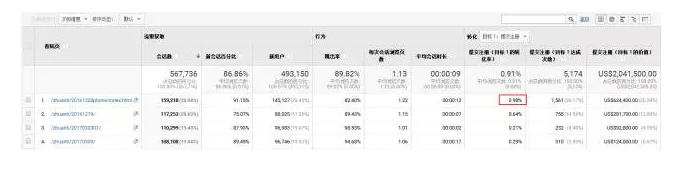
After launch, this page achieved a 0.98% conversion rate within its feed ad placements.
04. Four Things to Watch Out For
- Relevance: Does your landing page actually deliver on what the ad promised?
- Focus: Pick one job your product solves for the user and explain it thoroughly. Don’t try to cover everything.
- Avoid talking to yourself: Lead with what the product does for the user, not with product attributes for their own sake.
- Whitespace: Don’t cram too much onto a single screen. Let users scroll naturally rather than bombarding them with information.
IV. You’ve Spent the Budget — How Do You Know If It Worked?
The real sleepless nights start after the money goes out. During peak renovation season these past few months, I found myself waking up at 3 AM to check ad accounts before I could fall back asleep. Here are the key data analysis methods I rely on:
01. Track Conversion Rate Trends
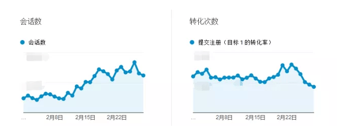
Once you’ve deployed your GA goal tracking on the registration button, you can monitor the daily conversion rate trend at a glance. Any unusual movement triggers a post-mortem.
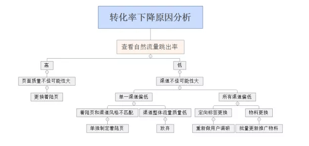
In the chart above, you can see a clear downward trend beginning in late February. When I see this, I use the analysis template below to diagnose whether the drop is caused by a decline in landing page conversion rate specifically, or by a deterioration in overall traffic quality.
02. A/B Test Landing Pages Using GA Experiments
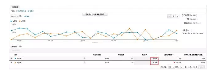
A single channel’s conversion rate running below expectations is a common and recurring problem. But simply swapping out the page every time conversion dips is not a rigorous approach. The better method: run the new page concept and the existing page head-to-head with a 50/50 traffic split. After a full week of continuous testing, the data will clearly show which version performs better for that channel. GA’s Experiments feature makes this straightforward to implement.
03. Heatmap Monitoring
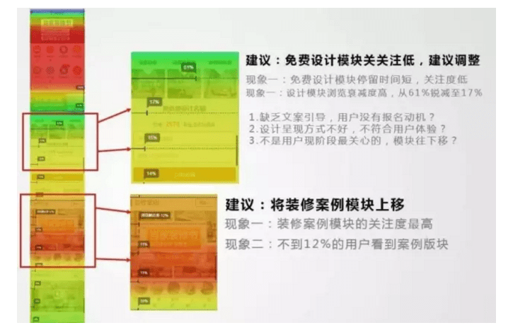
When you’re driving significant traffic volume, micro-iterations to landing page conversion rate matter enormously. A 0.5% lift in conversion rate can translate directly into hundreds of thousands of RMB in saved media spend. I use Ptengine for heatmap analysis. On one page, for example, I found that 61% of users who saw the first screen had dropped to just 17% by the second — a loss of 44 percentage points. Was the conversion module introduced too early, triggering user resistance? The sections where users spent the most time were the hero image and design case studies. Should we move that content higher up the page? By forming hypotheses from heatmap data and testing them, you can continuously iterate your page toward better performance.
04. A Final Thought
The full loop — from building your initial audience persona hypothesis, to gathering performance data, to refining and correcting that hypothesis — is a continuously self-improving feedback cycle. The longer you run campaigns, the sharper your read on your target audience becomes. You evolve from someone executing instructions to someone holding one of the company’s most valuable strategic assets: validated, data-backed knowledge of exactly who buys and why. That knowledge saves your company real money every time you run a campaign, and it makes you very difficult to replace.
Source: Nuanshi Network. Author: Gu Weisheng — Home renovation campaign optimizer; post-90s, based in Beijing. Interested in exchanging notes with others in the digital marketing space. WeChat Official Account: feiyue2333.